SHOP ACATAINMENT
SITE SEARCH
Quick Links to Topics
Ambiguity
Argumentative Essays
Audio Attraction
BOOKS - Bibliomania!
Critical Thinking
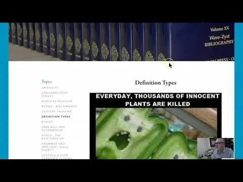
Definition Types
Ethics
Free Will and Determinism
God(s), the Existence of
Grammar and Spelling ("Gold Sheet")
Leopold & Loeb - Darrow's Closing Argument
Logic, Principles of Reasoning, and Mind
Metaphysics and Epistemology
Parmenides of Elea
Teaching Philosophy
Validity & Soundness - Help with Problems
EVENTS
MoFo Podcast
MoFo Blog
home
Videos
ABOUT
Take Action
SHOP ACATAINMENT
SITE SEARCH
Quick Links to Topics
Ambiguity
Argumentative Essays
Audio Attraction
BOOKS - Bibliomania!
Critical Thinking
Definition Types
Ethics
Free Will and Determinism
God(s), the Existence of
Grammar and Spelling ("Gold Sheet")
Leopold & Loeb - Darrow's Closing Argument
Logic, Principles of Reasoning, and Mind
Metaphysics and Epistemology
Parmenides of Elea
Teaching Philosophy
Validity & Soundness - Help with Problems
EVENTS
MoFo Podcast
MoFo Blog
home
Videos
ABOUT
Take Action
EDUCATIONAL VIDEOS LISTED ALPHABETICALLY
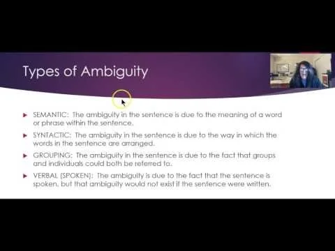
Ambiguity!
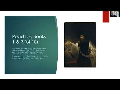
Aristotle's Eudaimonia Theory
Basics of Argument Evaluation
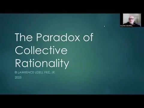
Egoism and the Paradox of Collective Rationality
Euthyphro - Proposed Definition of Piety #1: Ostensive Definitions and Their Shortcomings
Knowledge and Descartes - A Brief Introduction
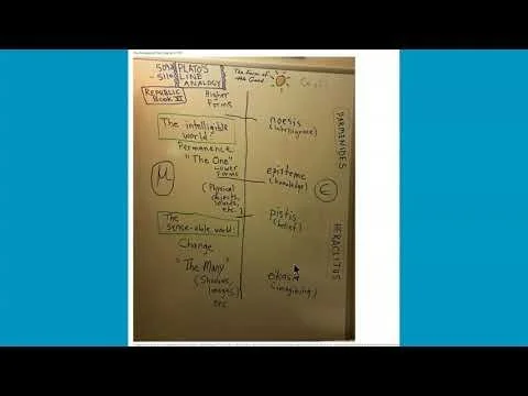
Plato's Line Analogy
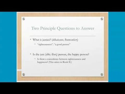
Plato's Republic - A Selective Overview - Larry Fike
SENTENCE TYPES !

